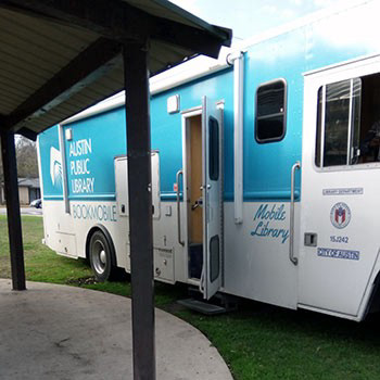
Austin Public Library's bookmobile.
The Problem
I discovered in a Pew Research study that library usage declines as the population ages. The study also marked an increase in the number of outreach librarians. I wanted to come up with a way to utilize community outreach and volunteers to help increase library usage among those who are unable to come to the library in person.

My Role
User Research, UX Design, Information Architecture, UI Design, Wireframes
Constraints
• Potential technical limitations of users
• Lack of time to complete high fidelity designs
• No user testing
Background Research
I interviewed four librarians and three volunteer coordinators for other non-profits to see how they handle community outreach. Interviews were done by phone and took about thirty minutes each. My main objective with the interviews was to see if there is a need for a service that connects volunteers directly to patrons.
I also conducted a contextual inquiry to observe librarians working within the community as they ran a mobile library.
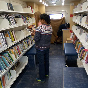
Library workers inside Austin Public Library's bookmobile.
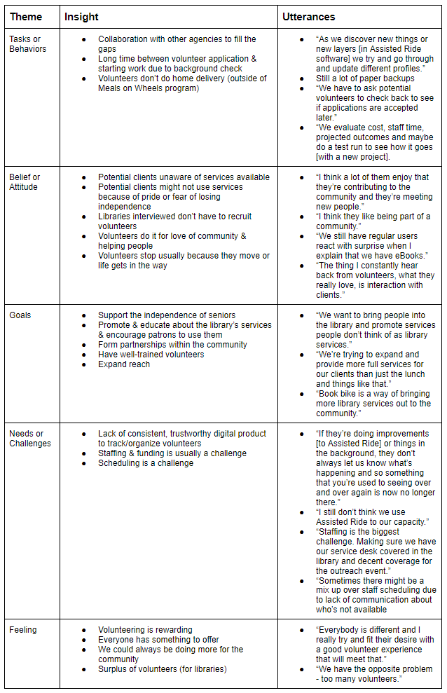
Finding Patterns
After transcribing each interview and my observations from the contextual inquiry, I synthesized the data to find patterns and supporting quotes from interviewees.
Requirements
Based on the research I conducted, I discovered these key requirements that should be included in the design to satisfy user needs.
• Allow volunteers to deliver library services to patrons’ homes and organizations (e.g. daycare centers for storytime)
• Track volunteer activity and allows for self-scheduling
• Activity information to generate reports to be used for grant funding requirements
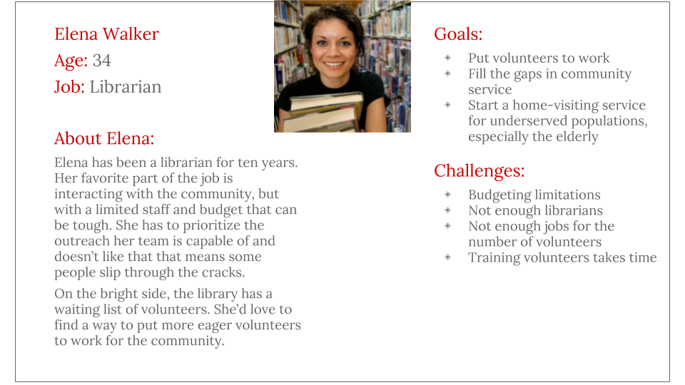
The Users
The primary user of the app would be library staff, who would use it on an administrative level. Secondary users would be volunteers with the main tasks of searching for jobs , signing up and fulfilling the requirements of those jobs. Patrons are the tertiary users, with their main task as making service requests.
Form Factor
When deciding on the form factor of the project, one of the first questions I asked: “Should this be a web-based app or a native app? After weighing the pros and cons of each, I decided that a native app was the best choice. This would allow the option for future iterations of the app to use smart phones as RFID scanners, letting patrons check out material on their own.

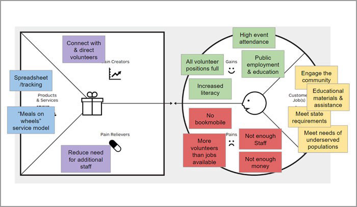
Value Proposition
I completed a value proposition worksheet to help define the role of my product as well as illustrate the value it adds to libraries and their patrons.
Themes
I defined a set of goals to ensure the user is first and foremost when design decisions are made.
Accomodate: Sign-up and use should be simple. Not all users are very tech-savvy. Touch-targets should be large and multiple languages options available.
Connect: Create a means for users to build community. This means connecting to each other as well as the library.
Facilitate: Librarians & library staff are the gatekeepers. They need a way to manage volunteers and match them up with participants that is easy and not time-consuming.
Task Flow
Most libraries require volunteers to have a background check, so I wanted to incorporate that into the initial user registration for the app design while also allowing volunteers to set their scheduling preferences ahead of time. I did that in two ways: A traditional task flow, as well as writing out the flow of the UI as a conversation between the app and the user, in this case, a volunteer.

UI as a conversation
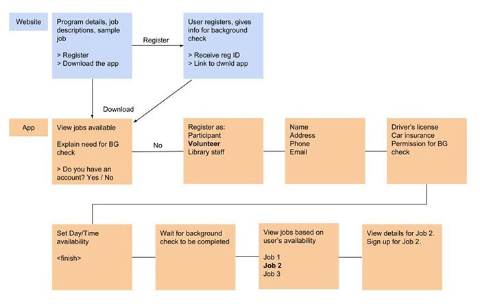
More traditional task flow.
Feature Definition
Once the task flow was established, I moved on to define and prioritize the jobs that could possibly be completed in a patron’s home, a school or in a mobile library setting: Book delivery, Storytime Helper, Tech Teacher and Book Reader.
Wireframes
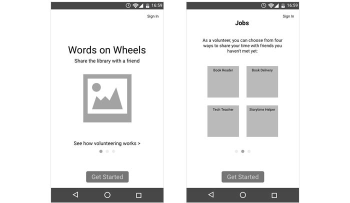
Two of three initial "getting started" introductory screens.
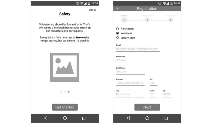
The final "getting started" screen, and the first of three Registration screen.

Remaining two of three Registration screens.
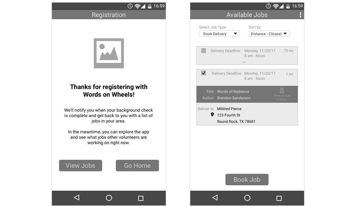
Registration complete screen and Available Jobs screen.
Goals Moving Forward
• Complete prototype
• Test with multiple types of users
• Finalize a cohesive visual design
Challenges & Lessons Learned
Time was a big constraint on the project. If I were to do the project again, I would spend more time sketching out ideas before creating wireframes. I think the main lesson learned here was that research done ahead of time can help me focus on what’s really important from the very beginning.